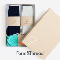
As promised here's some images of the magazine I designed, it's called Articles and I created it on behalf of a menswear brand. The idea of our final project was to create a new brand or brand extension, I chose to create a homeware store aimed at the male market.
So that's all you need to know, here's a few of the pages, there's 24 in total so I couldn't put them all up or we would be here for ever. Thank you to everyone who commented on my last post, it means a lot that people are interest in what I've been working on.
The big heading is this coming Friday!
14 May 2011
Subscribe to:
Post Comments (Atom)






that looks really, really great
ReplyDeleteWish I had more of an eye for design
This looks fantastic, the design is perfect, colourful but fairly simplistic. Well done, you must be very happy
ReplyDeleteI really like the pages with the photos and the sketches over them, cool!
ReplyDeleteohhh, i love the aesthetic! especially the bright block coloured pages put together
ReplyDeletevery professional looking, well done!
ReplyDeleteThis looks gorgeous. Particularly like the Objects of Use.
ReplyDeleteThat looks seriously amazing!
ReplyDeleteHey Matt it is great to see the inside pages too. I think it s great that it has a male perspective - there is a definite gap in the market for this. Xxxx
ReplyDeleteLooks gawjus! Love the brightly coloured backgrounds and the doodles
ReplyDeletexx
It looks really, really cool, Mat. There is so much creativity in the new magazines these days and yours is right up there!
ReplyDeleteproper aweeesome! proud of ya. xo
ReplyDeletepretty cool work, mat. i like that it's very reader friendly. you know how man like things simple and neat without so much fuss.
ReplyDeletenouveauskin.blogspot.com
clever cat.
ReplyDeleteRight, so I was away and had no clue you're doing this , and didnt see the last post, so when i was looking at the pictures i was like 'oh that's so pretty! Is that like a new magazine?' it turns out it's YOUR magazine, well done Mat! It looks real professional and awesome! I love art!
ReplyDeleteGreat to see you inside work. You centennially have lots of talent.
ReplyDeleteLee x
looks interesting.
ReplyDeletewould u send me one?! pleaseeeeeeeeeeeee?!
ReplyDeleteit looks brilliant! i hope you're proud :) x
ReplyDeletetalented guy!
ReplyDeleteWow...Congrats! These photos look great. What an accomplishment.
ReplyDeleteEee looks amazing, good job.
ReplyDeleteHelen, X
http://areyoudressingupordressingdown.blogspot.com/